THREE POINTS TO KEEP
- List the details that must remain fixed.
- Gather references in one place.
- Create sensitive text and logos in controlled layers.
- 01Reference
- 02Constants
- 03Shot
- 04Review
A conceptual workflow · No client results or performance metrics are represented.
Define the constants first
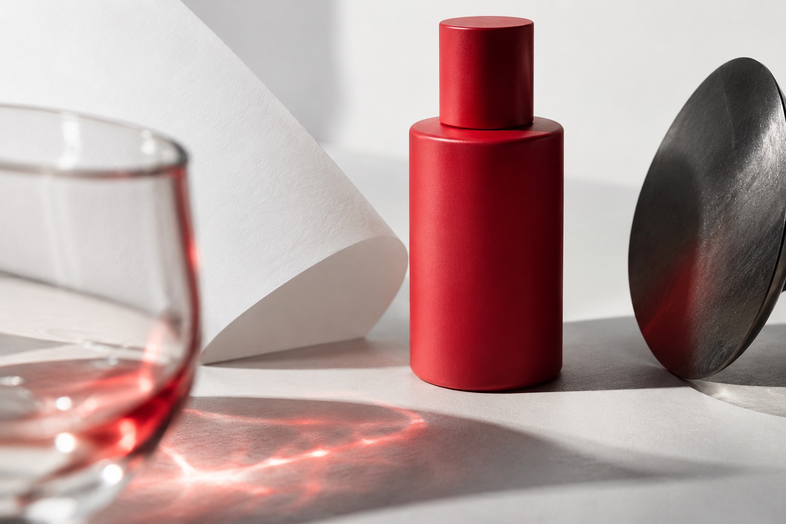
Separate the details that cannot change: a product’s proportions, cap shape, packaging material or main colours. For a recurring character, prepare a short reference sheet for clothing, hair and distinctive appearance. This establishes a shared understanding before prompts are written.
Choose the details that matter to the campaign. Product silhouette, brand colour and use case may be essential, while background details may allow more freedom. This keeps the direction clear without removing every creative possibility.
A reference is not a perfect lock
Some video models accept reference images as generation inputs. Google documents this workflow with model-specific conditions. Check the current documentation for supported reference types and limits before planning production.
A reference does not guarantee exact product or character preservation in every frame. Labels, materials and appearance can still shift. Treat the reference sheet as an input, not as a replacement for final review.
Related official guidance: Google Cloud · Generate videos from references
Plan logos and text separately
A logo, price, product name or campaign condition must be accurate. Preparing these elements as controlled design layers can help. Where the shot allows, generate the main scene and place verified typography and logos during motion design or editing.
This is not equally simple for every scene. A moving label in perspective needs different work from a flat overlay. Tracking, masks, framing and whether the shot is usable must be considered separately.
Establish a small visual system
Add colour samples, lighting direction, framing preferences and texture to the production sheet. Explain which elements hold the overall feeling together as the scene changes. If the same brand uses daylight and hard red night light, there should be a narrative reason connecting them.
Assess visual quality and brand fit separately. A shot can look impressive while still belonging to a different campaign.
| Element | Keep fixed | Allow to change |
|---|---|---|
| Product | Shape and key detail | Framing and scale |
| Colour | Identity relationships | Light intensity |
| Text | Verified wording and logo | Placement |
| Character | Distinctive appearance | Pose and action |
Review frames and the whole edit
Check individual clips, side-by-side comparisons and the edited sequence. Can the product still be recognised in different light? Do camera directions connect? Does the character look like the same person? Consistent stills do not automatically make a coherent film.
A problem may require regeneration, a shorter usable section or compositing. Rejecting a shot is also a design decision. Final review should use verified product information, approved text and the client’s sign-off.
Working checklist
- Product shape
- Identity colours
- Character details
- Verified text and logos
- Shot continuity
Brand consistency is a selection discipline as much as a tool setting. Knowing which details cannot change helps you judge the results more deliberately.
Let’s discuss your projectSources and scope
Tool-specific statements were checked against the official resources below on 5 October 2026. Features and access conditions may change; check the current documentation when planning production. Workflow examples and checklists are editorial suggestions, not model guarantees or client performance claims.